Mobile App Design
Wireframing & Prototyping
Figma
Competitive Analysis
Usability Testing
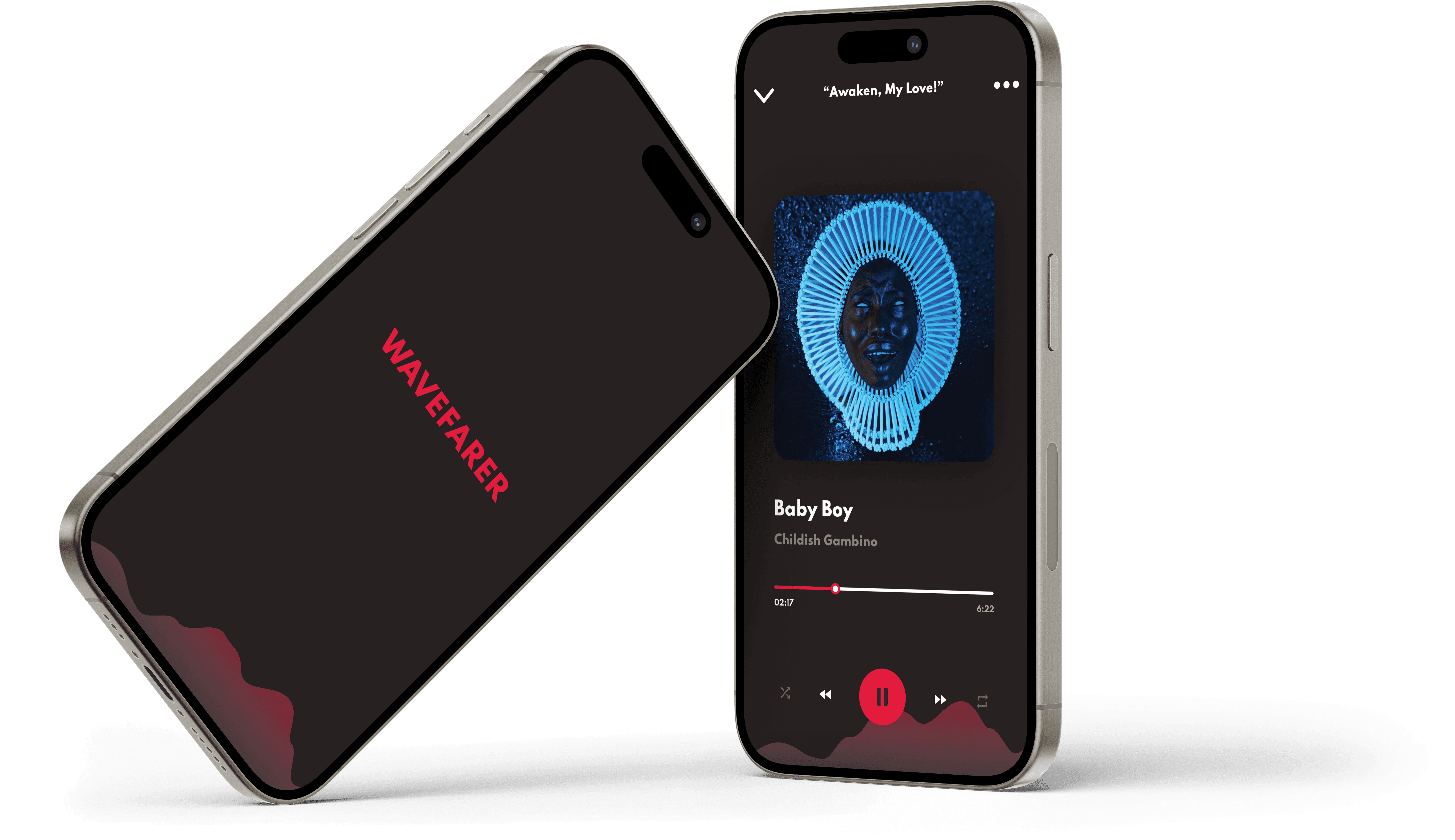
Wavefarer - Discover Your New Sounds
Introducing a premium plan to a multimedia streaming platform
SCOPE
End-to-End Design
90 Hours
ROLE
UX Research
UX Design
UI Design
Interaction Design
Brand Design
PROJECT OVERVIEW
Wavefarer is an audio streaming platform that has been operating on a freemium based model for the past 2 years in order to build up a user base. With its foundation of users established, the company was looking to introduce premium service and was looking for an MVP to be developed to onboard existing and new users.
PROBLEM
ONBOARDING
Drive new users to sign up with the premium version of the platform
CONVERSION
Convert existing members of the platform to the new premium service
PROJECT PREPARATION
Project Plan
A project plan was developed to establish deliverables and deadlines that were feasible within time constraints
RESEARCH
Competitive Analysis
Analysis of current industry leaders was conducted to understand how key players were driving users to upgrade from a free to premium service and what Wavefarer could implement in their platform
YouTube
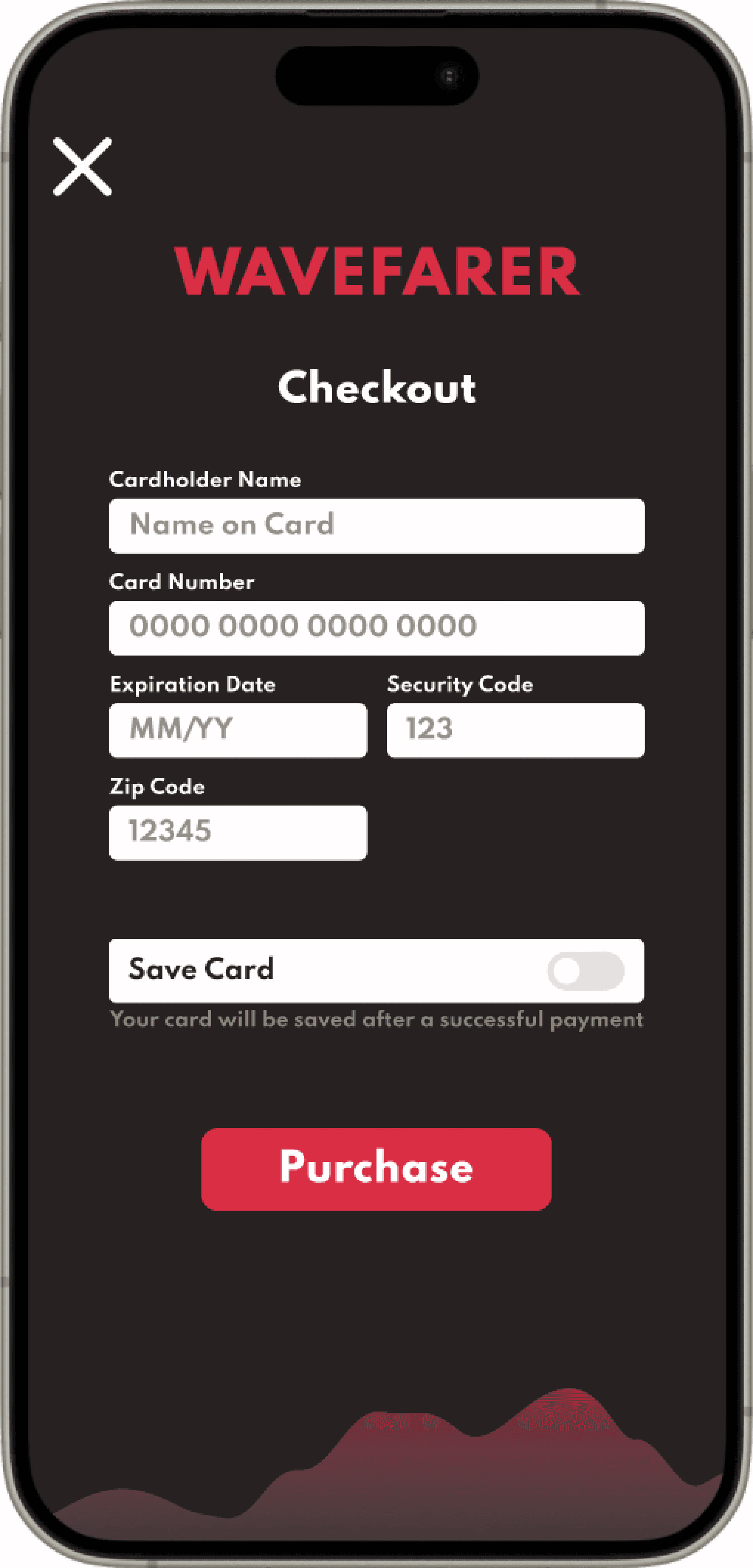
Ensure simple checkout process reducing clicks and easing frustration/fatigue
Spotify
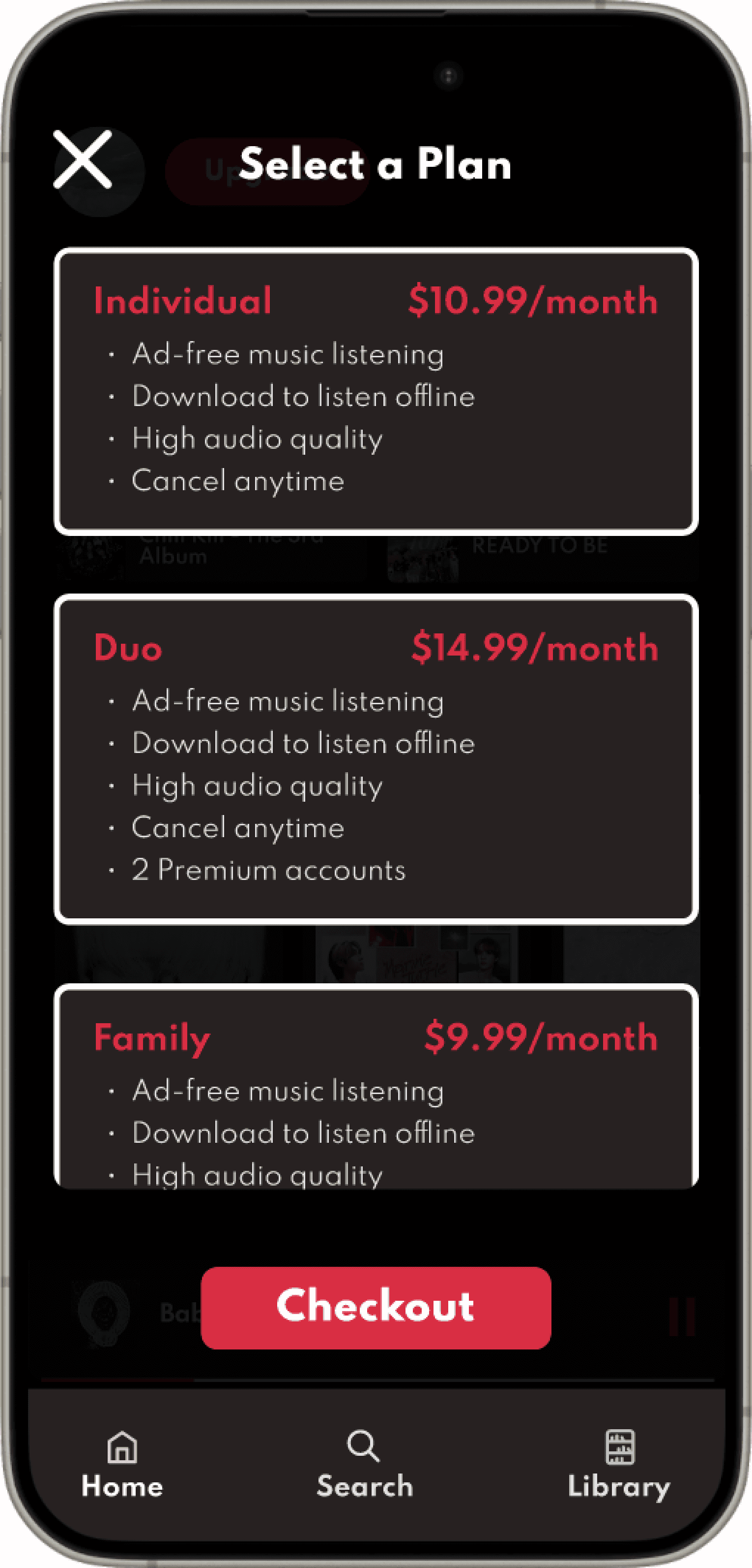
Include multiple plan options to give sense of flexibility and allow for quick comparisons
Pandora
Include a sticky CTA button that isn't intrusive but still visible
CONCEPT DESIGN
User Flows
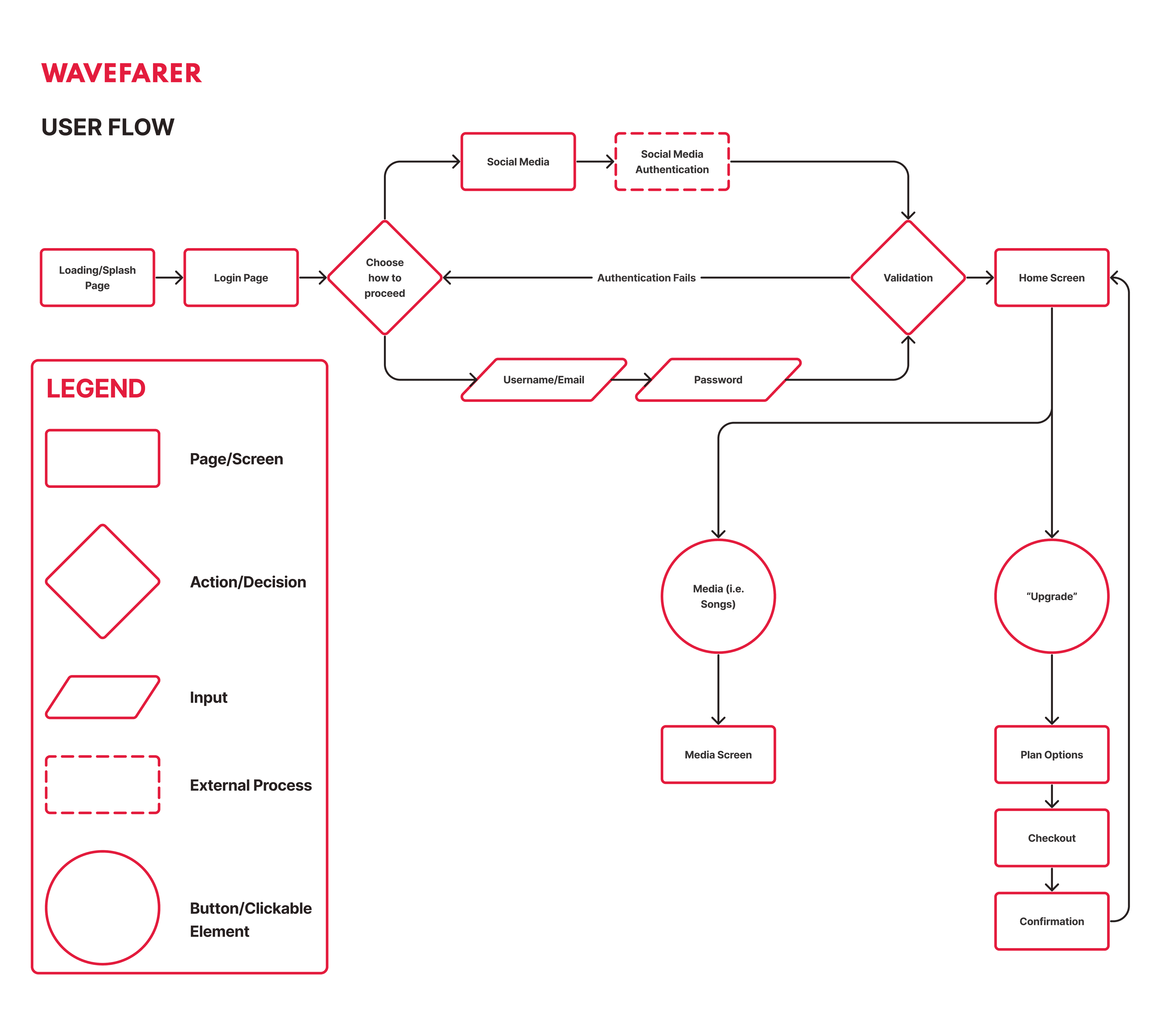
The main red route was identified to determine the steps users would need to take in order to upgrade from the free to premium version.
*Note: While one of the original business goals was to upsell new users directly upon sign up, it could be a major friction point to try and convert users before they’ve engaged with the platform so a CTA was not included in this solution
Ideation
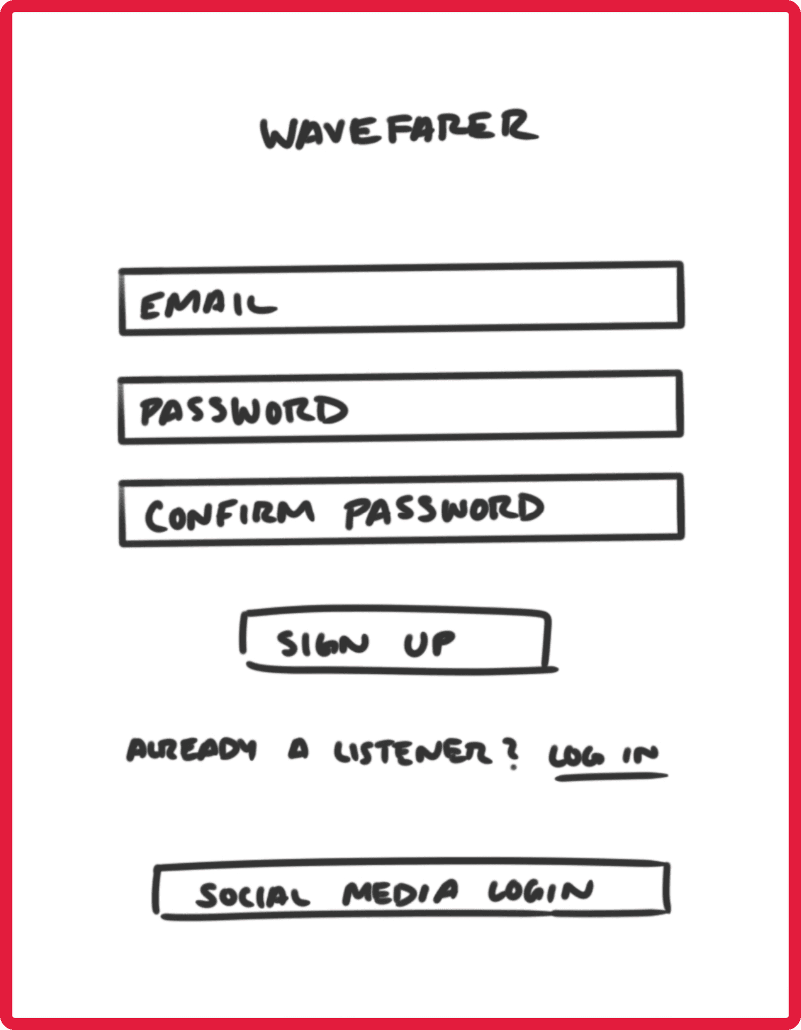
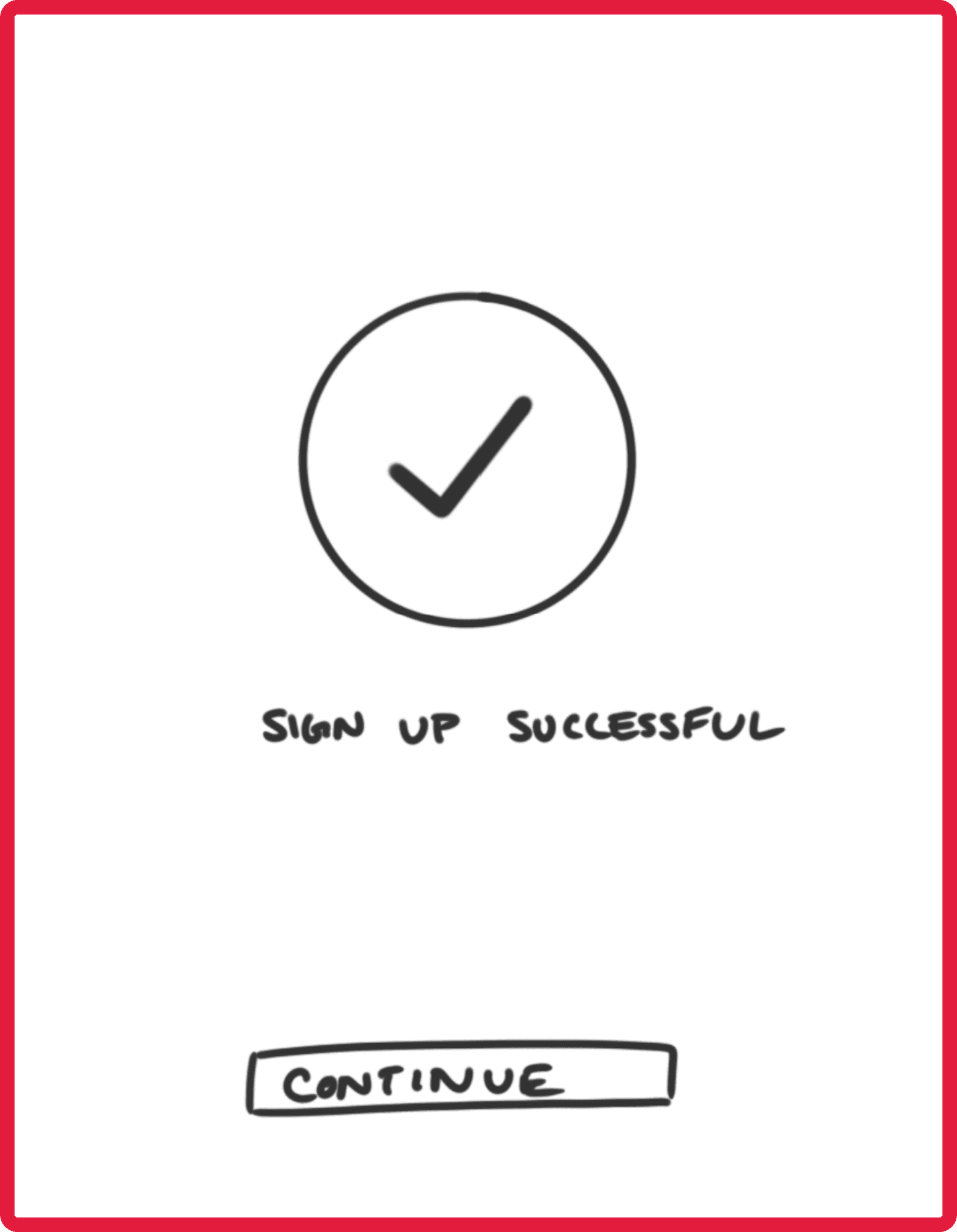
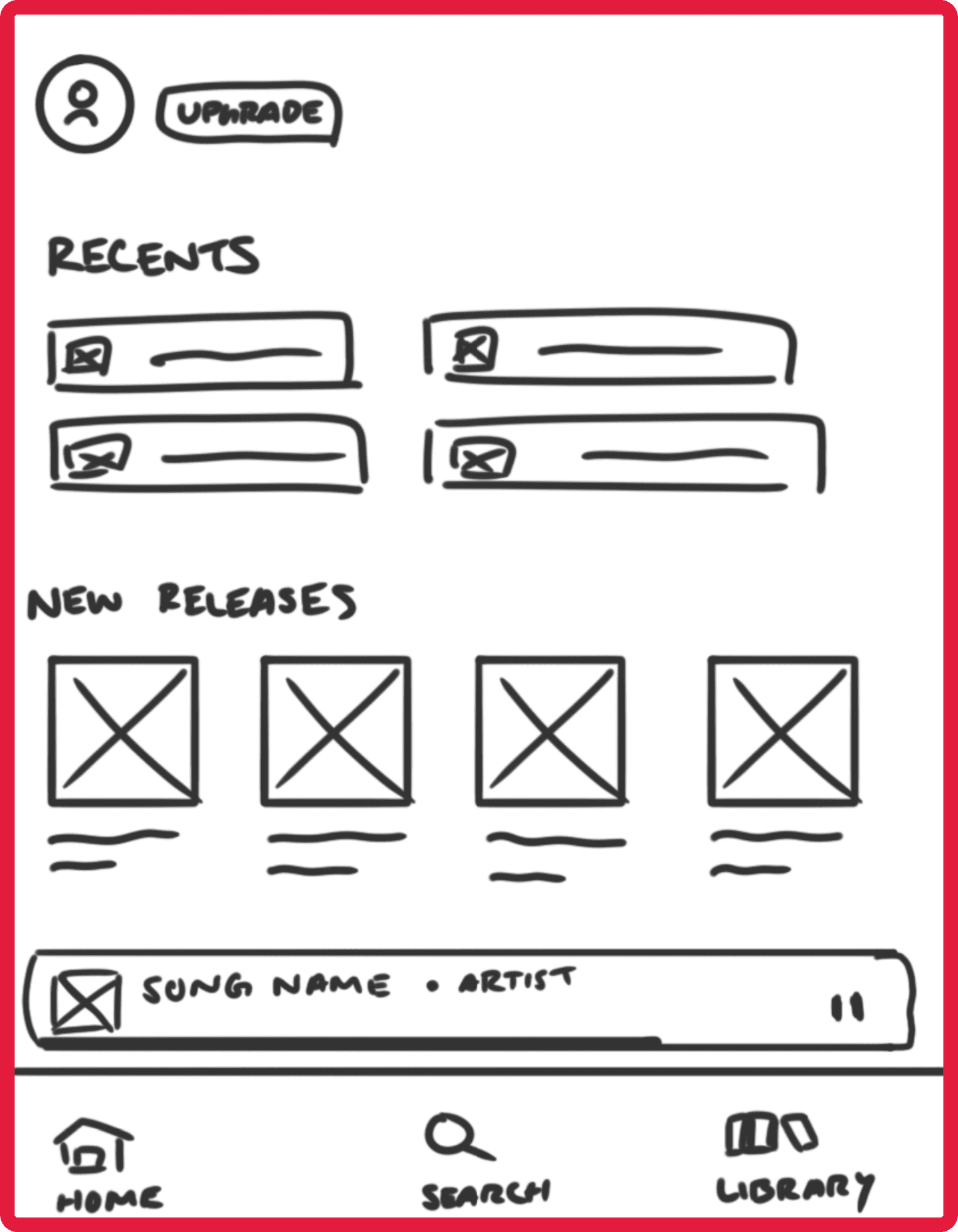
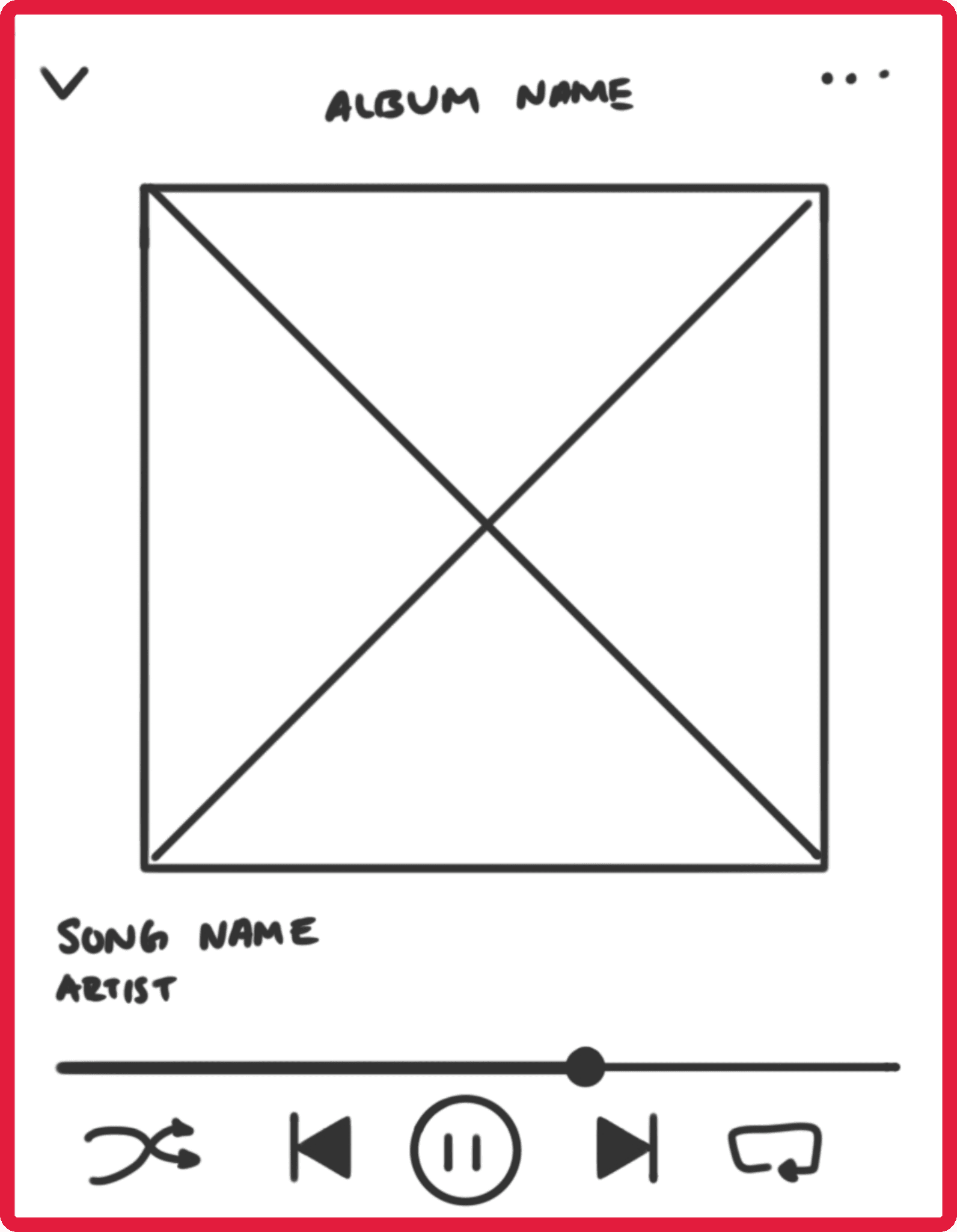
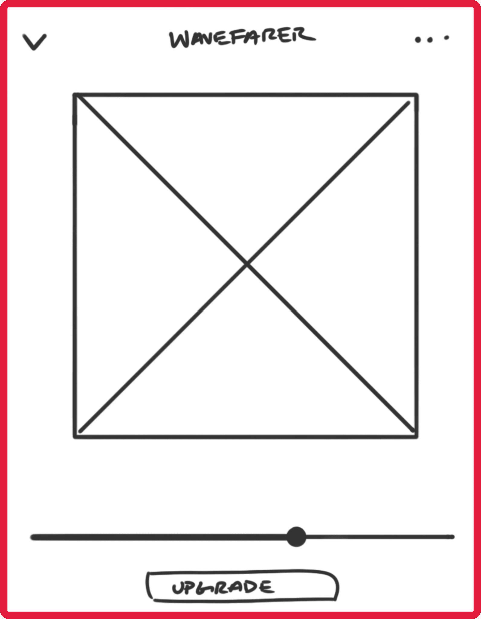
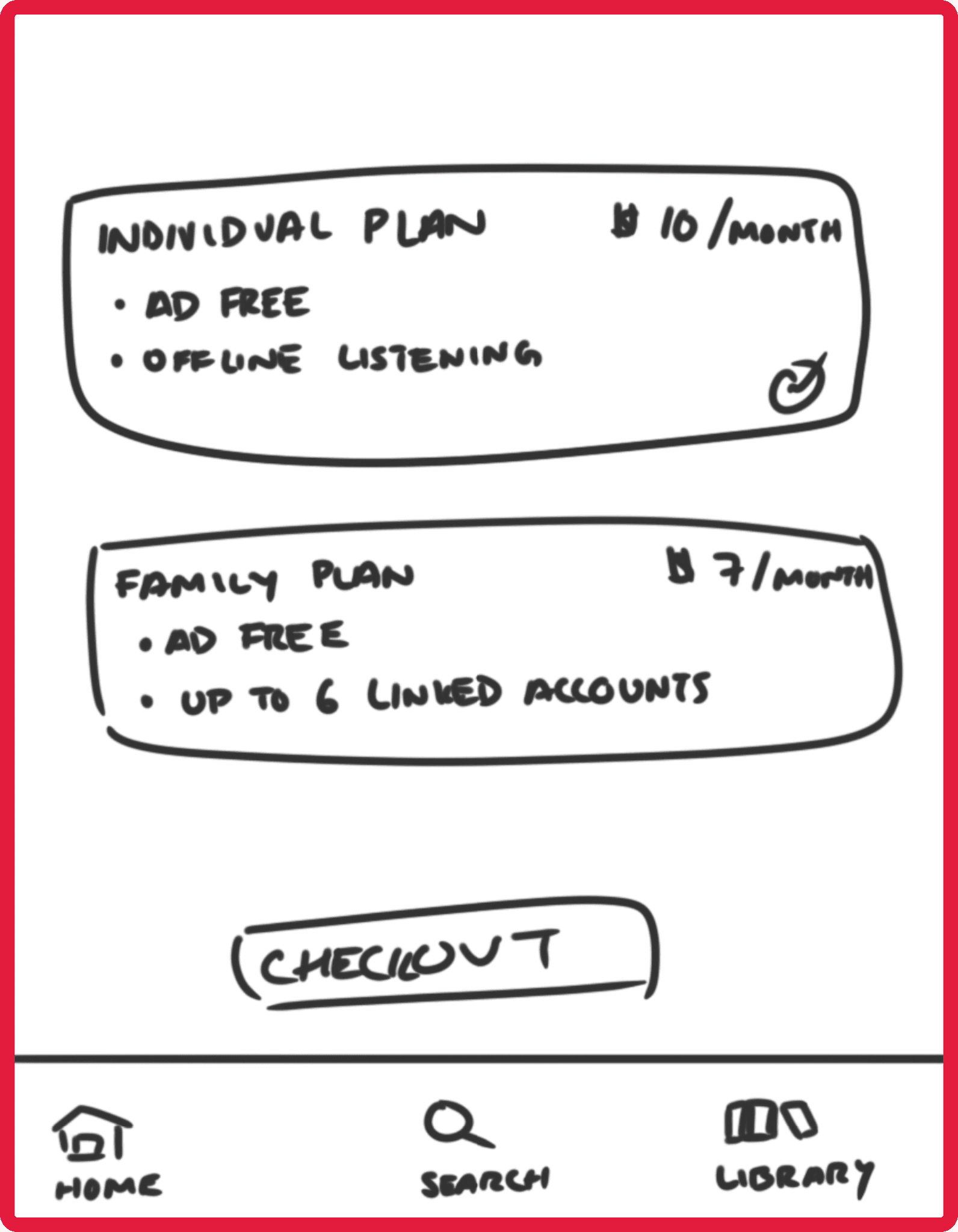
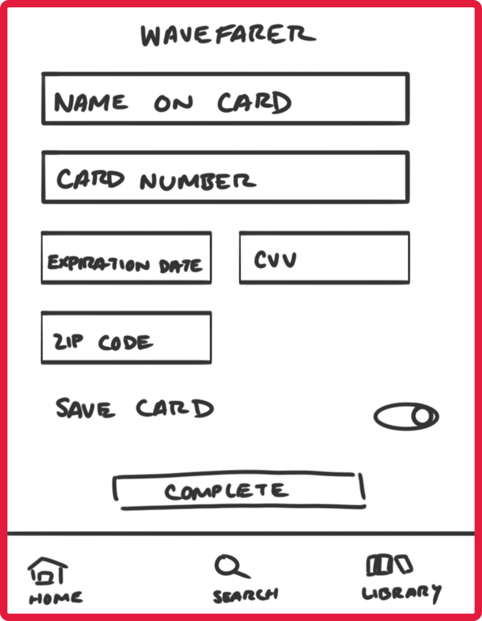
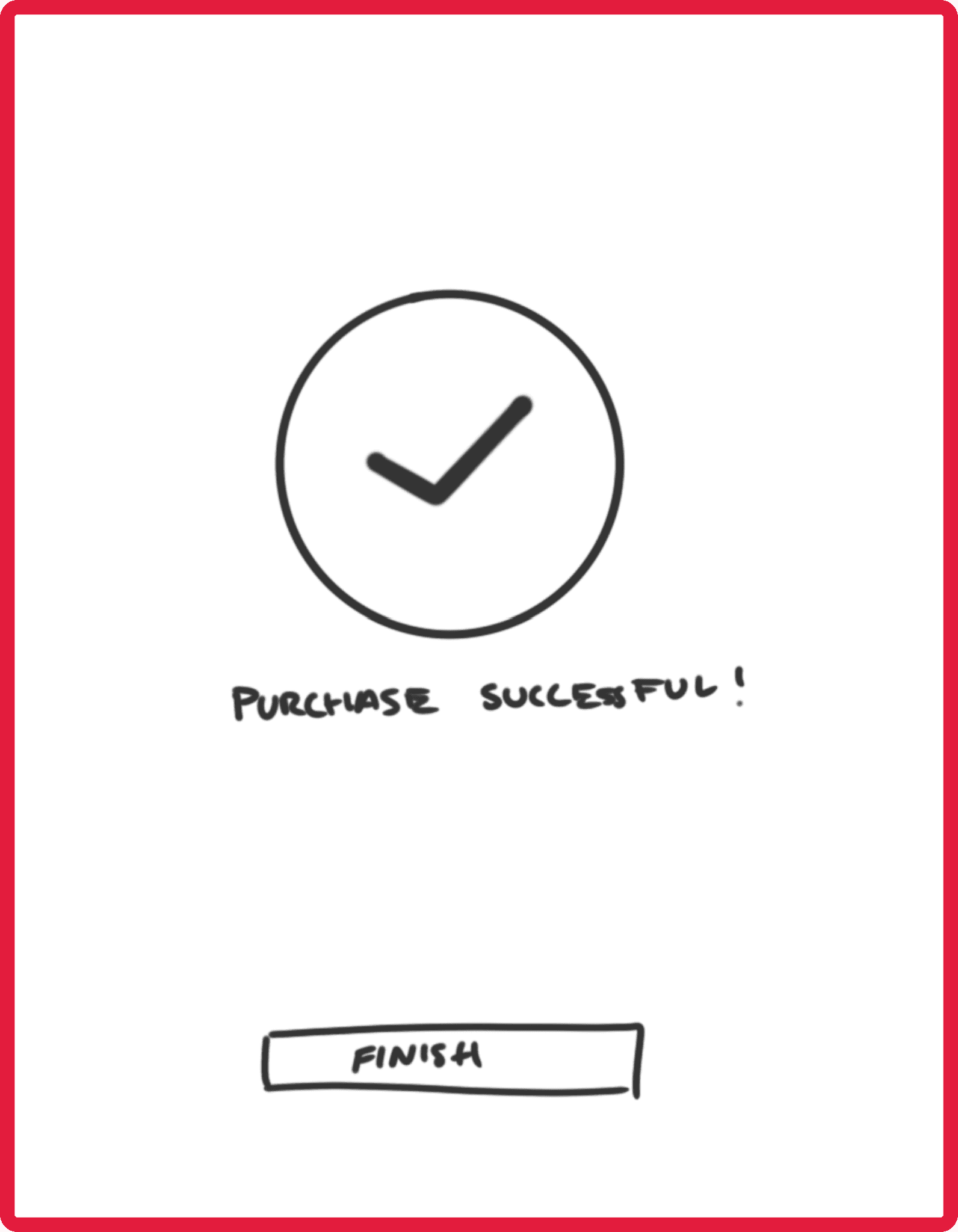
Potential design solutions were sketched out for the MVP based on the red route and previous research
Initial Usability Testing
A round of usability testing was conducted with the sketches created prior to moving on to the development of high fidelity mockups. Key findings from these sessions of usability testing were the below:
Trapped
Users don't have exit routes on the plan options page making it cumbersome to return to previous pages
Anonymous
Users confused by what the information they filled out on the checkout screen would be tied to since no user information was required during sign up
Findings from initial usability testing were used to address the obstacles:
Trapped
Exit
Included a button on the top left of the screen so that users can very easily exit the plan options page
Anonymous
Identifiable
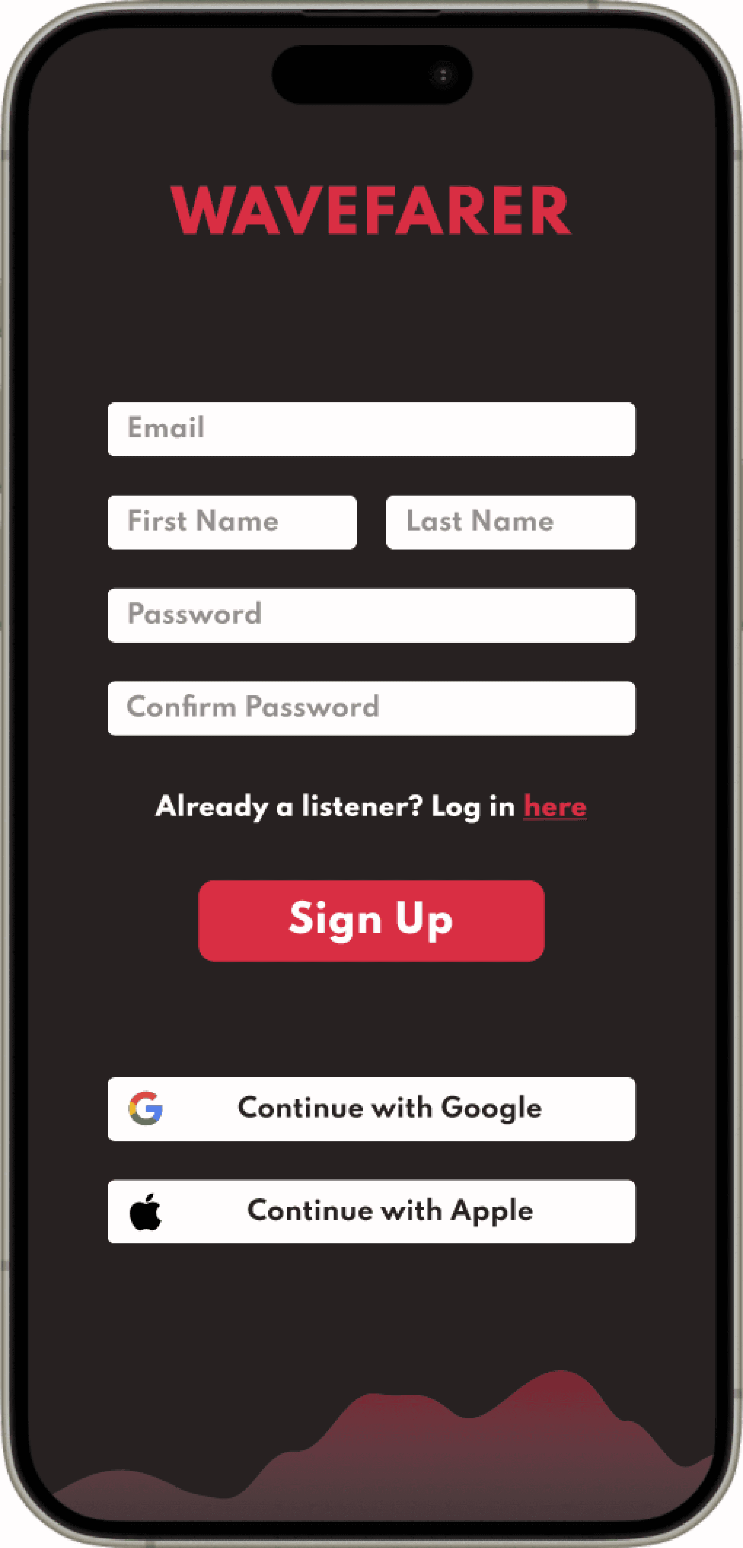
Adjusted sign up screen so users can input their name that will be used as part of their profile and account
STYLE GUIDE
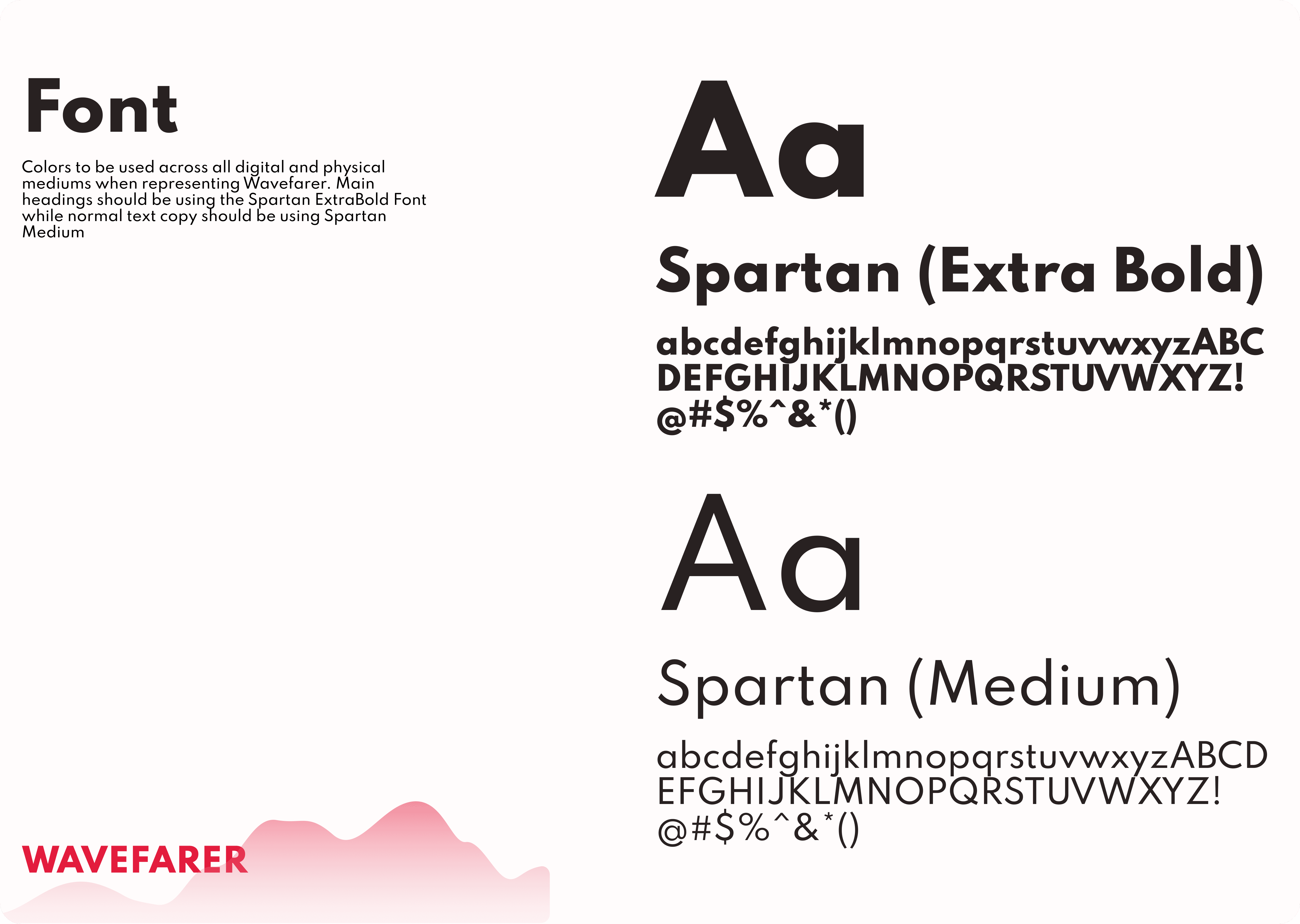
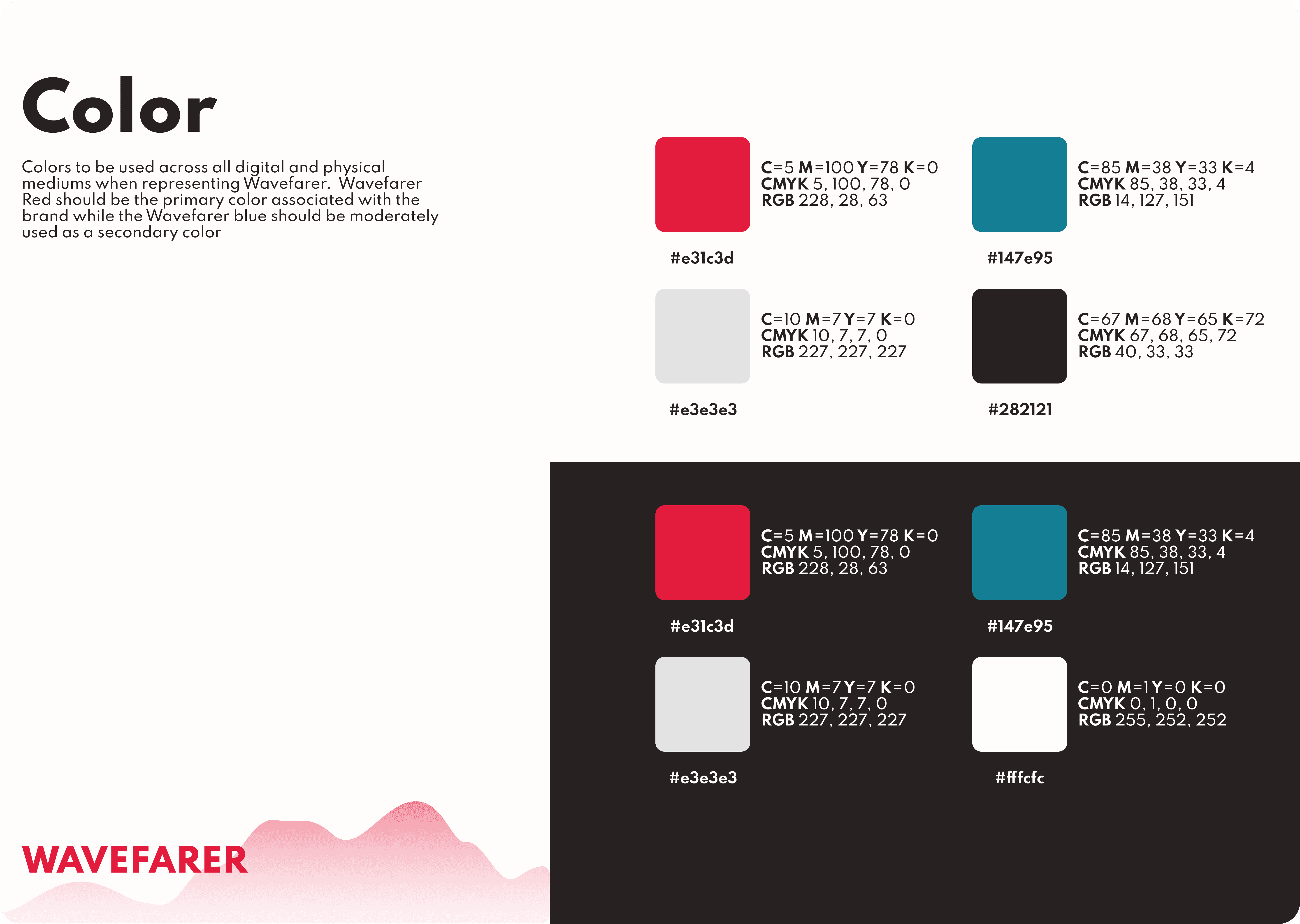
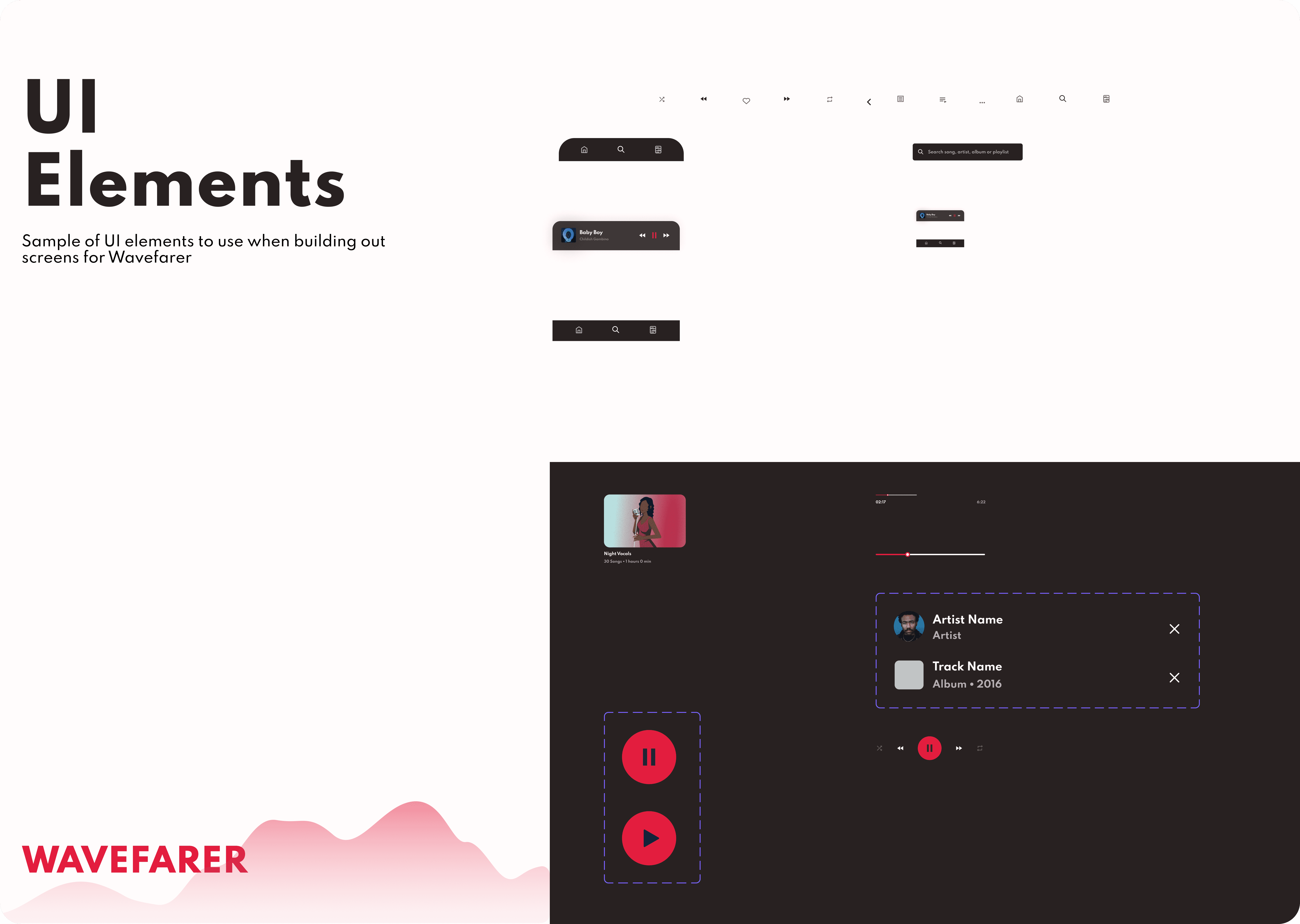
A style guide for Wavefarer was developed based on the brand attributes and personality from the brief
HIGH FIDELITY MOCKUPS
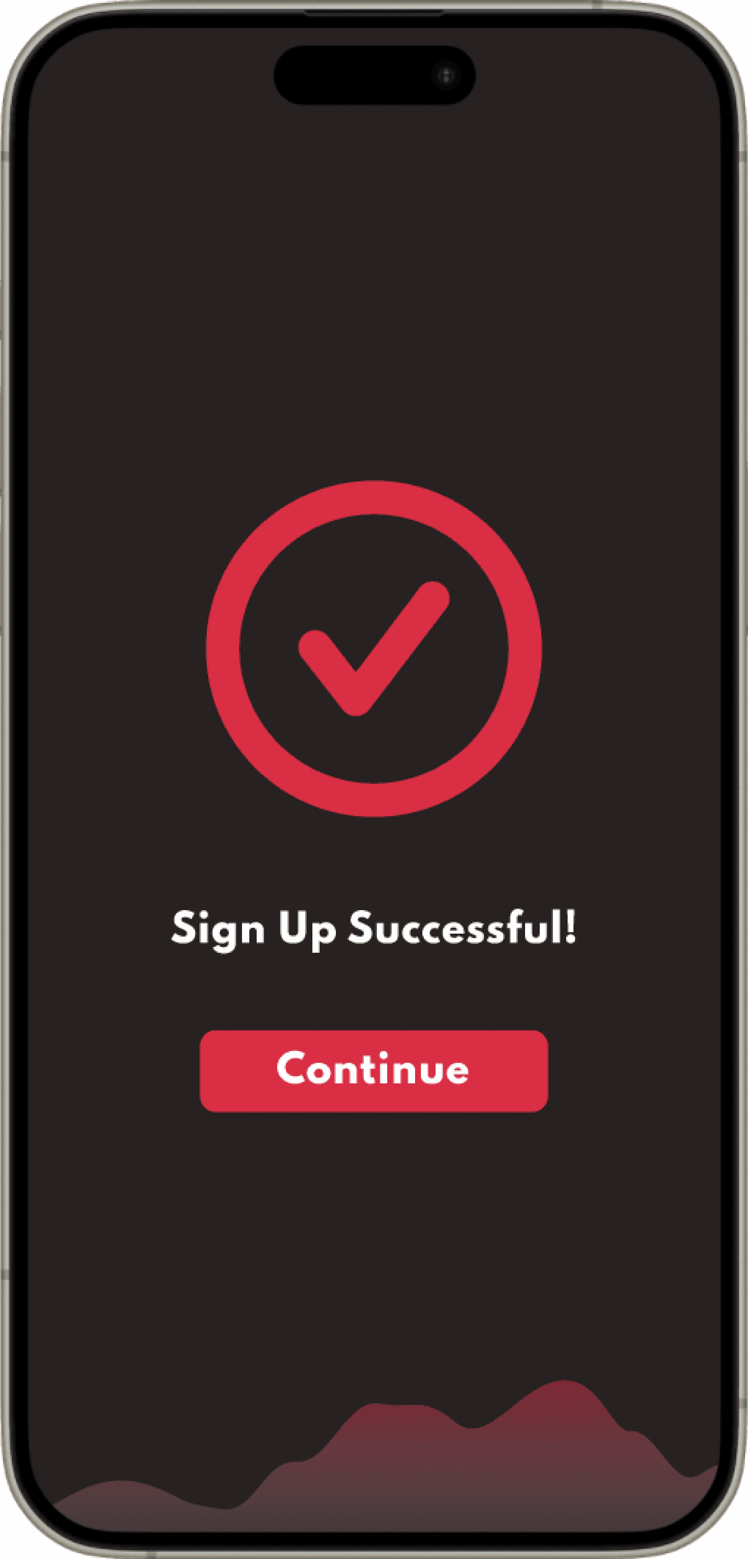
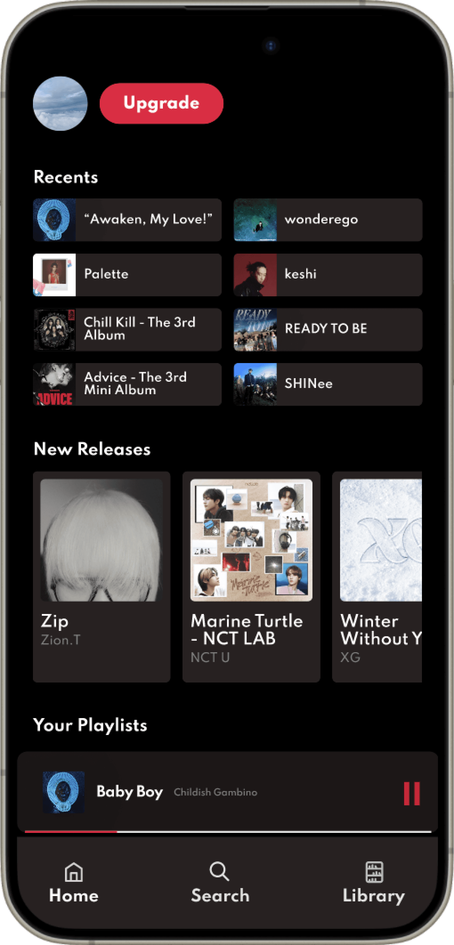
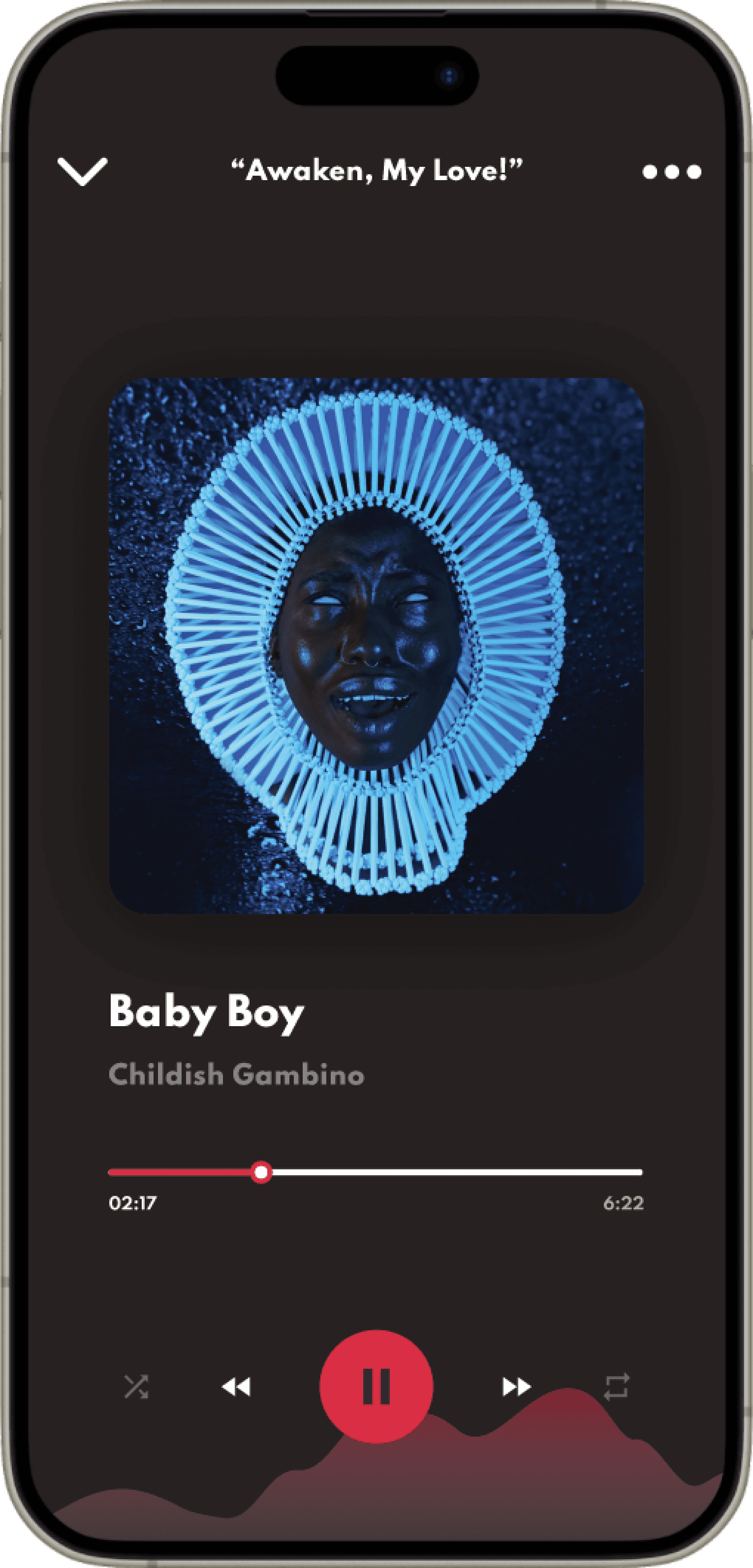
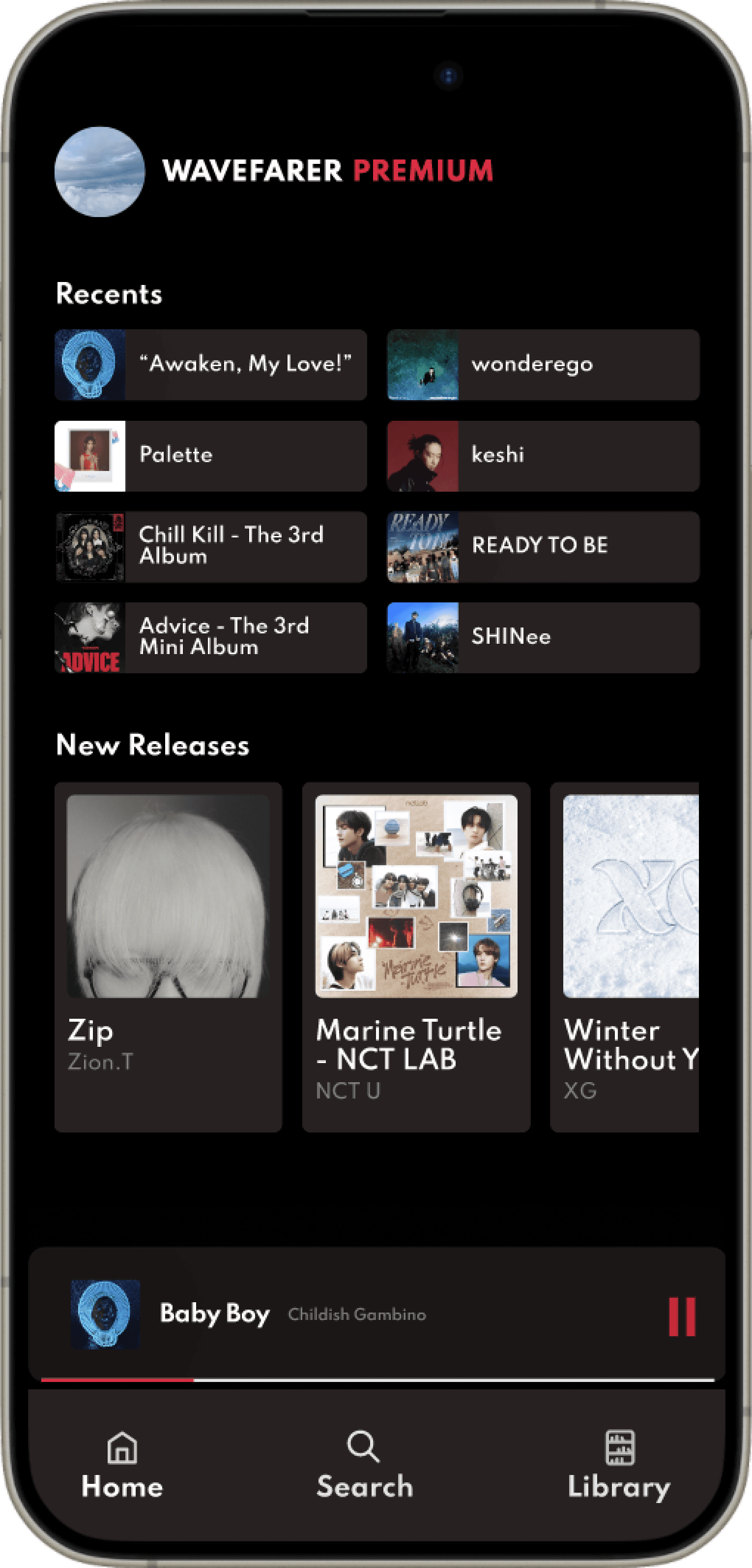
High Fidelity Mockups
Findings from initial usability testing were used to inform the development of hi-fi mockups:
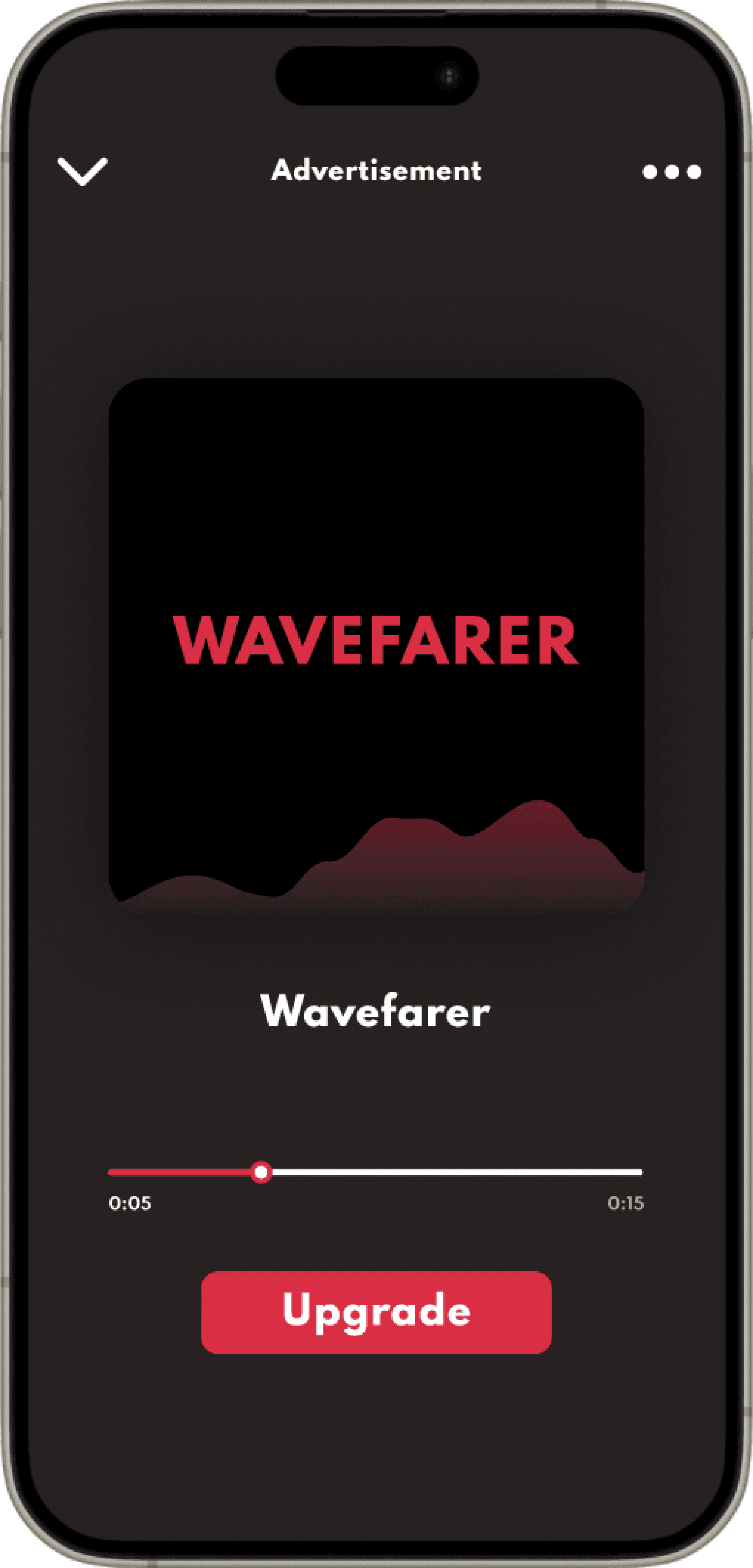
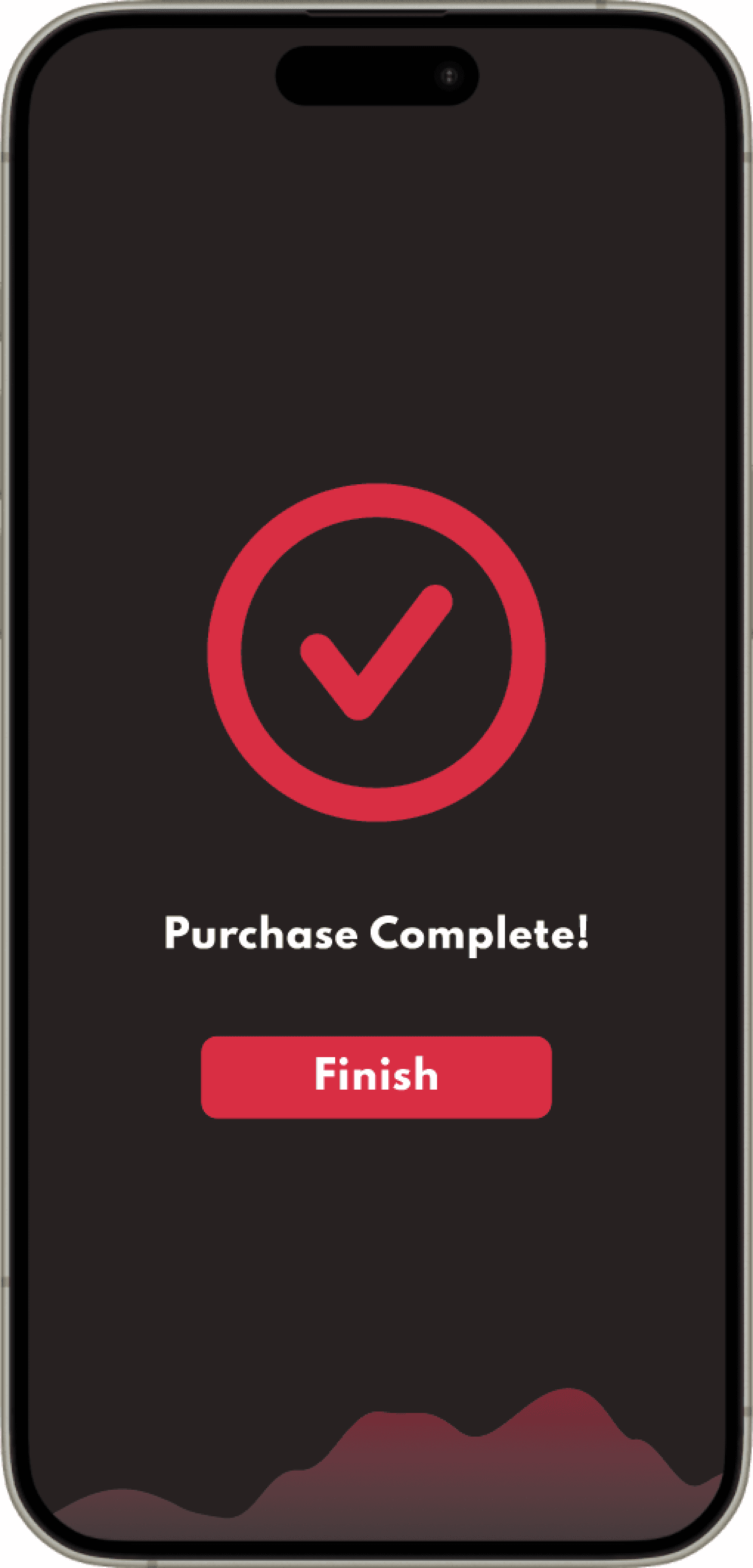
An overview of all screens in the prototype can be found below:
USABILITY TESTING
Usability testing was conducted with the hi-fi prototype this time resulting in the below key findings:
*Note: While the below were obstacles that some users ran into when performing the task of signing up and upgrading, it did not prevent users from actually completing the task.
Limited
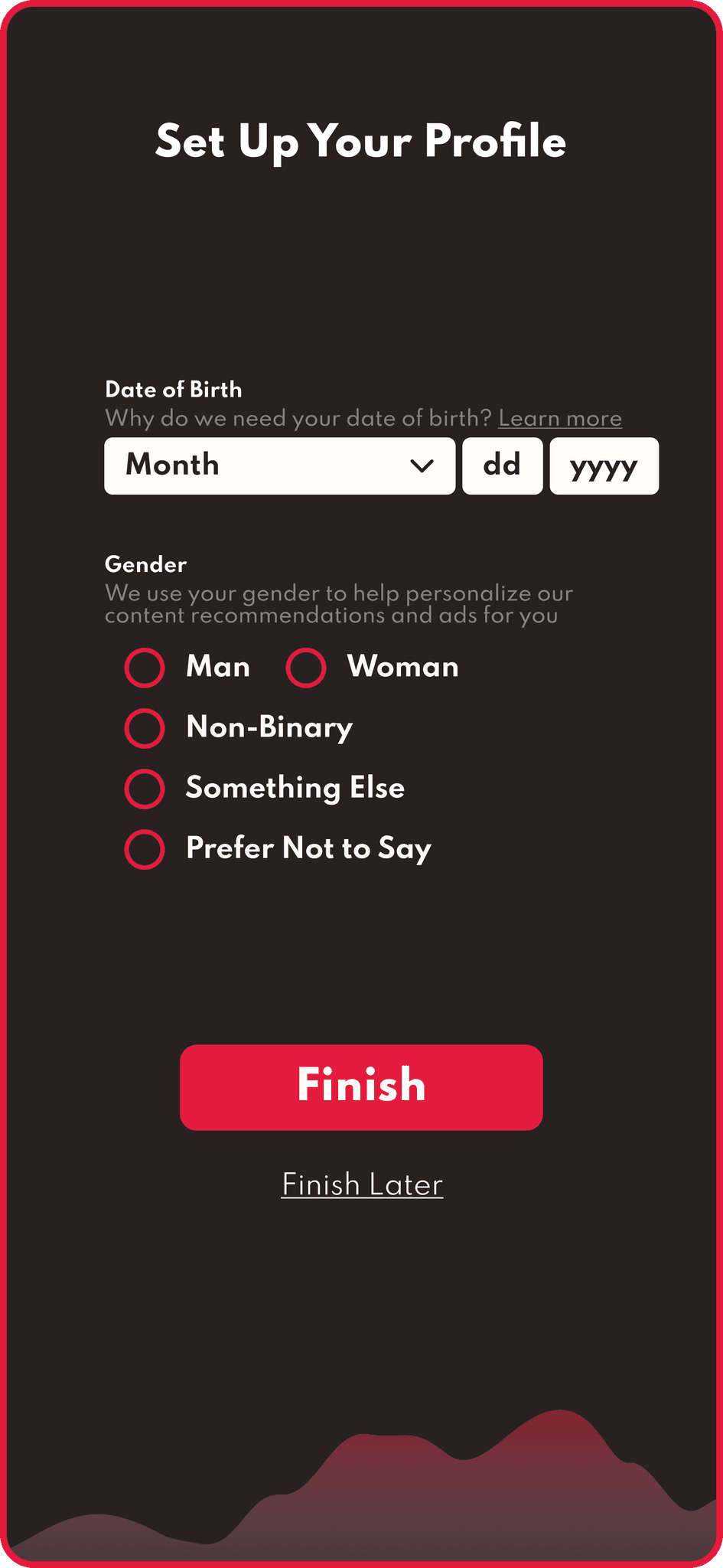
The sign up page doesn't ask for certain additional information that may be featured in a user’s profile (i.e. age, gender, birthday)
Uncontrasted
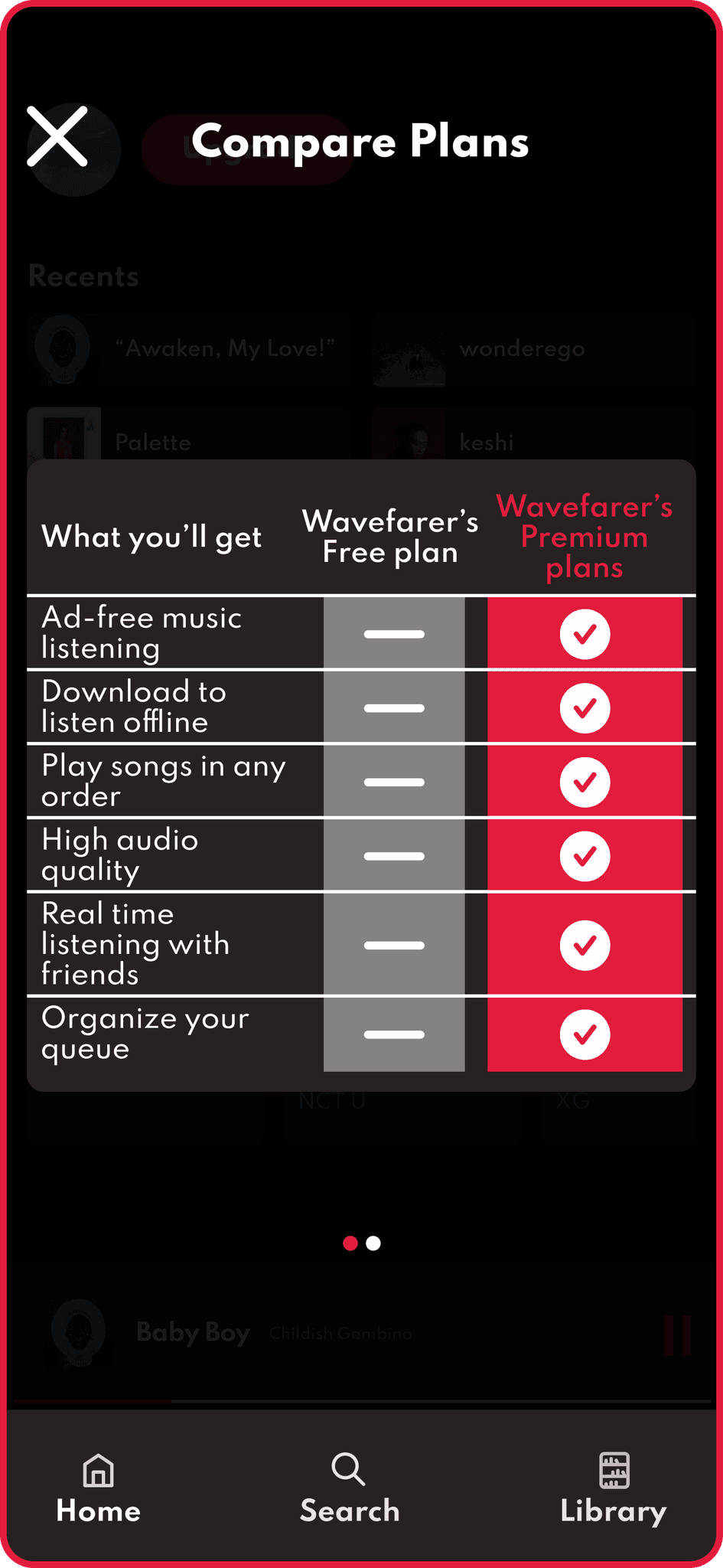
The 'plan options' screen doesn’t currently allow for comparisons between the premium and free plans
Quality of life adjustments were made in the first round of iterations:
Limited
Expanded
Additional step in sign up process added so users can fill out additional profile information
Uncontrasted
Comparative
Included chart in screen prior to the plan options to clarify what free users are missing out on
NEXT STEPS
1.
Retest iterations with another group to ensure QOL adjustments enhances the user experience
2.
If stakeholders are still interested in upselling to new users, can A/B test upgrade screens directly after sign up
3.
Adding additional flows to showcase the variety of audio content supported (i.e. podcasts, and audio books) could incentive upgrades
